







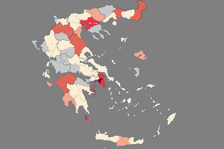
Everyday, at the daily COVID-19 Greek update conference, Professor Tsiodras states the latest figures of the epidemic worldwide. He enumerates the total number of people that have been infected, the total number of mortalities and the number of people that have recovered. Those frightening numbers respectively “2,920,877”, “203,164”, “836,612” increase every day. However, as our memory is limited, the figures fade away and do not permit us to visualise the development stages of the epidemic. For these reasons, the numbers retrieved each day can be plotted against a timeline.
Fortunately, there are various institutions that record daily figures of infections, deaths and recoveries We have been using the data from “worldometers.info”, a reference website that provides real-time statistics for diverse topics. It is owned and operated by data company Dadax, which generates revenue through online advertising. They have a coronavirus section which not only produces global but individual country data. In addition to daily infection and mortality rates they provide cumulative daily data as described above. The numbers are even plotted against a timeline and can be retrieved by placing α cursor on relevant point on any of the curves. They define the curve as follows:
- “Total Cases” = total cumulative count This figure includes deaths and recovered or discharged patients (cases with an outcome).
- “Total deaths” = total cumulative count
- “Total Recovered and Discharged” = total cumulative count
They have produced an interesting additional curve: the “Active Cases” curve which is derived by removing deaths and recoveries from total cases. Thus, one gets “currently infected cases” or “active cases” i.e. cases awaiting for an outcome (recovery or death).
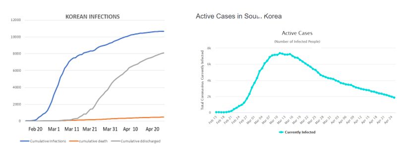
In the “Price of Unpreparedness” we derived such figures for different countries and plotted the figures for total cases ( “Cumulative Infection” curve in blue) , total recoveries (“Cumulative discharge” curve in gray) and total deaths (Cumulative death curve in orange). We explained that the epidemic is complete, when the infection curve has become horizontal and stops extending and also that, at this point in time, the blue curve of recovered cases reaches the level of the cumulative infection curve minus the cumulative ultimate death point on the mortality curve.
We reproduce below the Korean curves that we previously displayed as they illustrate fittingly a well-advanced state of the epidemic. We also reproduce the “Active Case” curve for Korea, which is an image from the “worldometers” webpage
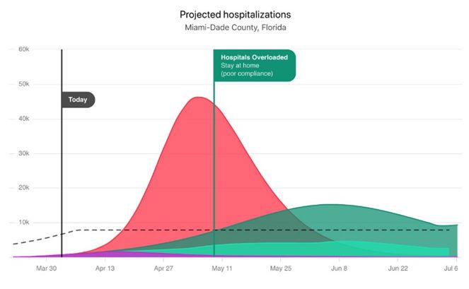
In the “Threat of Free Movement”,we displayed an IHME curve illustrating how by exercising social distancing one could flatten the amplitude of epidemic, so that the severe cases would not exceed the hospital capacity.This what is referred to as “flattening the curve”.
NY State Governor Cuomo in his daily press reports has used even more sophisticated data that he uses to tackle the limited number off ICU beds and mechanical respirators or ventilators as they are named there.
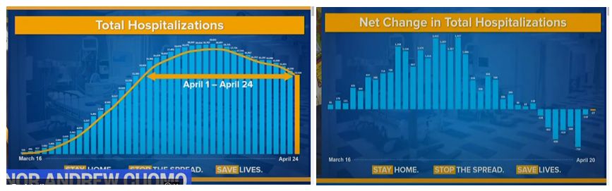
The bar charts above show on the LHS the number of daily hospitalisation rates and on the RHS the hospitalisation increase rate. As the number of hospitalisations decreases, the rates become negative. The yellow lines that one can observe are 3 days moving averages curves based on the bar chart daily data.
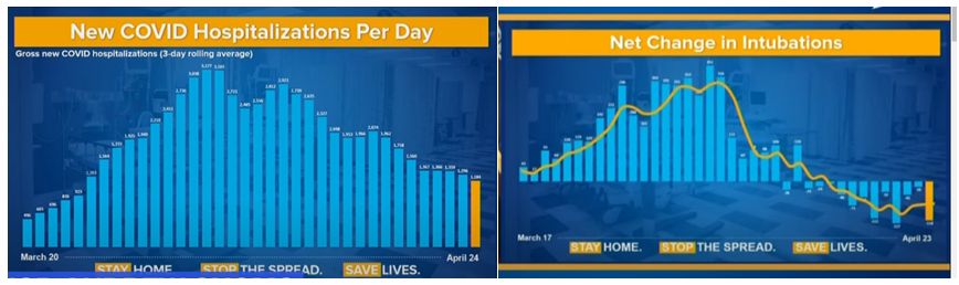
The daily new hospitalization /day is similar in nature to the daily infection rate, except it represents only the severe cases. Further on the RHS one can see that there are less intubations which is a sign that the consequence of the epidemic may be slowing down. The infection rate although not shown on these figures reached its apex around the 18th of April. Professor Tsiodras also mentions every day the number of patients that remain in intubation.
What can be seen is that the Governor is at this time more concerned about not being overstretched, than reopening the State to business. He may be very well right. The unexpected rise in infections in Japan seem to have overwhelmed the hospital system.
The Governor has also uncovered another conundrum: the number of asymptotic cases is much more extensive than previously believed. After having carried a state-wide 3000 people antibody test over the whole state 13.9% were found with antibodies to COVID-19 statewide but when only the New York city area was considered, the rate shot up to 21.2%. So that would mean that in just New-York an additional 1.7 million people were probably infected. This not only throws in shambles all the statistics of mortality rates but also alerts of the danger off contamination by asymptotic individuals. It certainly evidences the absolute necessity of extensive testing across the whole population.
| By Digenis | 26 April 2020 |